Quantcast RochesterSubway.com : A Better Bus Stop Sign for Rochester
Rochester Subway
Subscribe for Email UpdatesBecome a Facebook FanFollow Us on TwitterRSS Feed Rochester History + New Ideas. Fresh from the Rochester Subway.

Topics


Rochester Subway Gift Shop


¤ Visit the Gift Shop


Modern Rochester Subway Map


Modern Rochester Subway Map

¤ View Details
¤ Buy at MetroPosters.com


City of Rochester, New York


City of Rochester, New York

¤ View Details
¤ Buy at MetroPosters.com


Rochester Neighborhoods Map

Rochester Neighborhoods Map

¤ View Details
¤ Buy at MetroPosters.com


Rochester Subway DVD

The End of the Line - Rochester’s Subway (DVD)

¤ View Details
¤ Buy at MetroPosters.com


Rochester Landmarks Poster

Rochester Landmarks Poster

¤ View Details

 | 

SOLD OUT


Work in Rochester

Work in Rochester

¤ View Details
¤ Buy from Amazon


Original Streetart by SPACEMAN

Original Streetart by SPACEMAN

¤ View All Spaceman Art


Old Rochester Photos<br>and Historical Views

Old Rochester Photos
and Historical Views

(Framed Reprints Available)

¤ View All Rochester Photos


Rochester Subway Cap

Embroidered Subway Cap

¤ View Details


Rochester Subway T-Shirt

Rochester Subway T-Shirt

¤ View Details


Rochester Subway Token T-Shirt

RTC Token T-Shirt

¤ View Details


Rochester RTC Token

RTC Token (1948)

¤ View Details

 | 

SOLD OUT


Roch. & Brighton Token

Roch. & Brighton Token
(1887-90)

¤ View Details

 | 

Add To Cart


Rochester Railway Co. Token

Rochester Railway Co. Token (1900-09)

¤ View Details

 | 

SOLD OUT


Rochester School Fare Token

School Fare Token (1948)

¤ View Details

 | 

Add To Cart


Rochester NYS Railways Token

NYS Railways Token (1909-38)

¤ View Details

 | 

Add To Cart


Rochester Subway Vintage Postcard

Vintage Postcard (1941),
Rochester Rail Equipment

¤ View Details

 | 

Order Reprint

¤ See All Vintage Postcards


Rochester Subway Vintage Postcard

Vintage Postcard (1938),
Subway & Broad Street

¤ View Details

 | 

Order Reprint

¤ See All Vintage Postcards


Rochester Subway Vintage Postcard

Vintage Postcard (1942),
Rochester City Hall & Subway

¤ View Details

 | 

Order Reprint

¤ See All Vintage Postcards


Rochester Subway Vintage Postcard

Vintage Postcard (c.1912),
Rochester’s Four Corners

¤ View Details

 | 

Order Reprint

¤ See All Vintage Postcards


Rochester Subway Vintage Postcard

Vintage Postcard (c.1905),
Erie Canal Aqueduct

¤ View Details

 | 

Order Reprint

¤ See All Vintage Postcards


Rochester Subway Vintage Postcard

Vintage Postcard (c.1928),
South Entrance to Subway

¤ View Details

 | 

Order Reprint

¤ See All Vintage Postcards


Rochester Subway + Trolley Transit Passes

Original Subway, Trolley,
and Bus Weekly Transit Passes

¤ View All Transit Passes


A Better Bus Stop Sign for Rochester

April 25th, 2011

I believe RTS could ease the lives of all of its customers and gain a substantial number of new riders simply by redesigning the bus stop signs. And I'm not afraid to donate some free design services to get us there. Here's my proposed redesign…

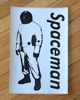
While visiting Seattle a few years ago something occurred to me. Here I was on the other side of the country in a city I had never been to before in my life, and I was navigating their bus system like seasoned Seattleite. There were no fancy digital real-time signs, I had no smart phone, no GPS anything… I didn’t even have a printed schedule. I didn’t need any of those things because I had this…

This bus stop sign in Seattle gives riders all the information they need to find their way.

A well-designed sign.

How can one sign improve the way an entire transit system is used? Let me give you an example.

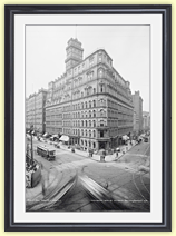
Before 1966 when the New York City Transit Authority (NYCTA) finally enlisted the help of Massimo Vignelli and Unimark Design Consultants to design the subway’s signage, the subway system was in a sorry state. Station signs were small and difficult to read from a distance. Random colors and styles were used. Directional signs were often slapped together by subway maintenance workers as they were needed. And new signs were constantly being added to clear up confusion caused by other bad signs. This only caused more confusion. Rider frustrations were high and ridership was low.

This problem may never have been addressed by NYCTA if it were not for a typographic designer named George Salomon. In 1957 Salomon made an unsolicited proposal to the NYCTA entitled “Out of the Labyrinth: A plea and a plan for improved passenger information in the New York subways.” In his proposal Salomon made many suggestions such as color coding the trains and standardizing typography on all signage.

LEFT: The mess of New York City subway signs at 59th Street/Lexington (c.1965). RIGHT: A page from the 1970 NYCTA Graphic Standards Manual.

As wayfinding improved, so did ridership. And the NYC subway signage system developed in the 1960’s is still in use today—for good reason.

Thanks to designers like Salomon and Vignelli most of the civilized world now recognizes the value of a well-designed sign. A simple icon or pictograph can transcend language and cultural boundaries. Clear, bold typography can cut straight through the noise of a busy city street. And the right color combination can speak volumes for a brand and the quality of its product.

In my humble opinion, redesigning the current bus stop signs would be the single biggest improvement RTS could make for its customers…

RTS bus stop signs are the same size and color as the thousands of No Parking signs that line our streets. The poor bus stop sign doesn't stand a chance of being seen by the untrained eye. That's a problem.

Just how often do you notice these signs while you’re walking down the street? How about when you’re zipping down the street in your car? Never. That’s because this RTS sign is as eye-catching as a No Parking sign. It’s the exact same size and color, and often times it’s sharing a pole with two or three other signs. That’s a problem.

A bus stop sign should be treated more like an informational sign in an airport or subway. It should stand apart from all other signage. It should say “HEY! LOOK AT ME… I’M PART OF A TRANSIT SYSTEM AND YOU CAN USE ME!” And it should be clear and easy to decipher by anyone—especially someone who may be using it for the first time.

An existing RTS bus stop sign at South Avenue and Court Street. At least 14 different routes stop here. But the only thing this sign tells me is that Route 7 does not stop here. That's a problem.

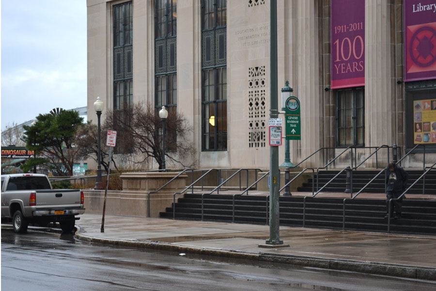
The RTS sign shown above is in front of the Central Library on South Ave. At least 14 different routes stop here. But the only thing this sign tells me is that Route 7 does not stop here. Why doesn’t it mention the buses that actually DO? Well, for one thing the sign is too small. But that’s just not acceptable.

I believe RTS could gain a substantial number of riders simply by redesigning this sign. And I’m not afraid to donate some free design services to get us there. Here’s my proposed redesign…

Bright and bold. There's no mistaking this sign for a No Parking sign.

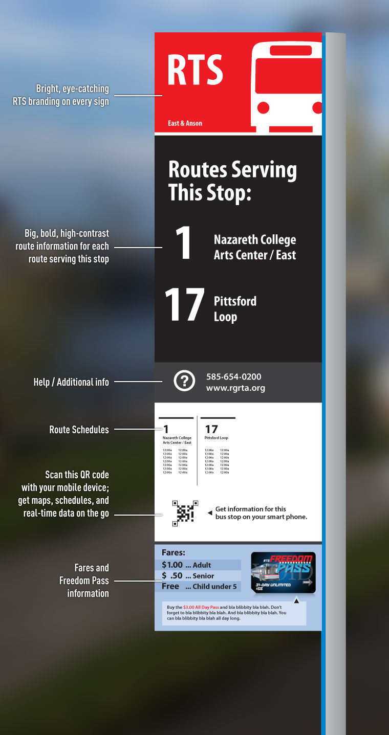
  • Bright and bold. There’s no mistaking this sign for a No Parking sign.
  • Very clean and professional looking RTS branding at the top of every sign. Indicative of a high-quality transit system.
  • All routes serving this stop would be clearly marked with large, high-contrast type.
  • A phone number and web URL on every sign in case you need additional info or customer service.
  • Route schedules for this stop—right on the sign where you need it.
  • Have a smart-phone? Scan the QR code and get a route map, schedule, and realtime bus location data so you can take this important information with you.
  • And finally, fare information. Those are actual prices by the way… $1.00!

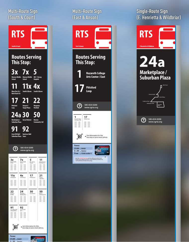
Also, this signage system would be modular so that each sign could be tailored to the specific bus stop. A bus stop served only by a single route would not require all the same information as a sign located in the downtown core where several routes converge. Regardless, all signs should look like they’re part of the same unified system (below).

Bright and bold. There's no mistaking this sign for a No Parking sign.

Now before I go to RGRTA with these designs, I need to hear what you think. If you use RTS on a regular basis I need to hear from you. Would a redesign be useful to you? Do these new designs do the trick; or is there something I’ve left out?

If you’ve never used RTS before, I REALLY need to hear from you. Would these new signs give you that little extra boost you’d need to jump on a bus next time you head out to the park or grocery store?

Don’t hold back. Leave a comment.

Tags: , , , , , , , , , , , , , ,

This entry was posted on Monday, April 25th, 2011 at 9:22 pm and is filed under Opinion, Rochester News, Transit + Infrastructure. You can follow any responses to this entry through the RSS 2.0 feed. You can leave a response, or trackback from your own site.

46 Responses to “A Better Bus Stop Sign for Rochester”

  1. Jeff says:

    I have never used RTS before simply for the facts you have stated, the signs are not clear enough and they are somewhat confusing.

  2. Chris Whittaker says:

    Now, would all of this be in one piece or in several components that can be changed out as pertinent information changes over time, or would a better option be extending the electronic signage to all dedicated stops (yes the up front costs would be higher, but over time this option might be less since the costs of changing and redeploying signage would be done at RTS offices.)

  3. nate says:

    First time Ive posted here but thought this is something to talk about. I really like your concept for the signage. Its always annoyed me how vague RTS is with its route signage. It does not even have a comprehensive route map on its web site which I consider very odd. The small costs & annoyance to RTS with changing signs when a route changes would be totally outweighed by the simplification and clarity of a sign system like this.

  4. Awesome. I had a feeling I wasn’t the only one thinking this.

    @Chris, realtime digital signs should continue to be installed in locations that make sense, absolutely. But check it out, there are bus stop signs every 300 feet or so on a typical route. That would be a lot of digital signs! And probably not necessary at every stop, especially in residential areas. Even in the digital age there’ll always be a place for good ole fashioned printed signs.

    I think the multi-route signs in Seattle’s downtown had modular pieces with a clear plexi cover over the info. Easily updatable.

    Anyone notice the QR code underneath the schedules?

  5. Nicole Shein says:

    You are spot on, my friend, and I’m going to share this post with my networks. I haven’t done a lot of bus riding in Rochester, and only in other cities out of necessity, for the very reasons you mention. It’s confusing, it’s intimidating, and I’ve never found it worth the bother. A redesign of the RTS signage such as you propose would not only unify and streamline the experience of bus riders, it would, in my opinion, help streamline the cluttered visual landscape of the city. These designs look fresh and modern; just what downtown, particularly, needs as it continues to undergo growing pain and repurposing pains. Best wishes with this project.

  6. Dean Rzonca says:

    The last time I was in NYC, I couldn’t help but notice how much better the bus signage was. Not as slick as the example from Seattle, but each stop had interchangeable tabs with each route, along with the direction and destination, in text large enough to read from a block away. There was also a schedule for each route.

    Compare that to Rochester…

    I pick up the bus home from work in front of the library downtown. While waiting, many people have approached me asking where to pick up various buses. The schedules don’t tell you much, and the signs are useless, so many people end up waiting at the wrong stop, and miss their bus. This is the first experience many people have with our bus system, and probably the last, too. RTS could gain a lot of riders by improving their signs.

  7. patrick says:

    If you were to change anything, I would suggest increasing the font size on the location (although E. Henrietta & Wildbriar might be a little tough). I think the signs are brilliant.

  8. Brian says:

    The signs are a great idea, and I love the design, but I just don’t see the RGRTA taking the time and money to upgrade their signage, when they (or is it the City?) won’t even pay to fix the bus shelter in my neighborhood, which was hit by a car last Fall, twisting the metal and causing the glass over the ad space to shatter? The condition of the stop has made it fair game for vandals to “tag” as well. Talk about discouraging ridership….

    Maybe I’m cynical, but if they’re so reluctant to maintain what they already have, I can’t see them paying for new signage unless it can be shown quantitatively that simply reducing confusion will result in a significant enough increase in ridership/revenue.

    That said, I would love for them to do it…as long as they remember to fix that shelter too.

  9. Karl Voelker says:

    I agree. One suggestion, based on my experience in Madison, Wisconsin, where I now live, is that you have to have a plan for how the schedule can be easily swapped out when it changes. Here, the route numbers are in large, readable type on a distinctive sign that is mounted fairly high and readable from the road, while the schedule is basically a piece of paper in a picture frame mounted lower on the pole and facing the sidewalk.

    Here’s an example of the route sign: http://www.flickr.com/photos/thetransitcamera/4733931434/in/set-72157620644891875. The sign is not as modern-looking as the design you proposed, but it is effective. And, as you suggested, signs with less routes on them are smaller, but follow the same design scheme.

    Oh also, every bus shelter (which are common downtown and on the UW campus) has a big map mounted on the wall showing the entire bus system.

  10. Mark O'Brien says:

    I really like the idea of the updated signs. Perhaps they could be purchased with a federal grant or something. The only issue I see with the signs with times on them is RTS usually updates their schedules 4x/year. Have you also noticed on Main Street, the soon to be used (I hope) displays with bus times?

  11. Les says:

    Where to begin…

    I remember there was some internal debate over the new signs several years ago before we deployed these when I was employed by them. I’m not a fan of the current design. They’re mounted too high and unless you have eagle vision or binoculars, you can’t read them.

    The old signs pretty much said “stand here long enough and a bus may eventually show up” so we added some more information to them as you can see – however the more info you add, the smaller the font and they become just as useless as the old signs.

    Since schedules and fares change – it means changing out thousands of signs across the system on a regular basis. Schedules on RTS change quarterly – some changes are subtle, others are substantial. Comes down to time and money. If you look closely at the RTS sign, you can see a sticker with the new $1.00 fare over the old $1.25 fare (something we knew would happen – debated over it – and well here you have it).

    But here’s the thing – the majority of the customer base of any transit system generally follows a fixed routine (i.e., going to/from school or work) and knows which bus/route to take, where the bus stops are, etc. Since quarterly schedule changes aren’t very dramatic, the “regulars” generally don’t notice. It may be useful for visitors to the area – but those customer are a very small minority. So looking at it from a return on investment perspective – doesn’t make a lot of sense to load them up with all that info.

    Now – large cities like Seattle, yes – it makes sense to load up the signs with info because you do get a lot of tourism and out of towners – in fact myself and a co-worker from RTS flew to Seattle to check out their fare collection system and we were good transit employees who made use of their transit system while we stayed downtown and did find that information useful. But your average Rochester business trip person is highly unlikely to use RTS. Most people who ride RTS generally do not have other alternatives.

    The signs serve other purposes… the stop number is on the sign is geocoded into the scheduling database and used to gauge route performance, passenger density, etc… so they are needed, but in my opinion, a small city like Rochester wouldn’t gain much benefit from a Seattle style sign.

  12. Les says:

    Oh, and the QR codes on the signs are actually a pretty good idea. Smartphones are no longer the domain of business executives.

    But I like your designs… shoot them an e-mail – you never know. They’re looking at using technology to improve the customer experience and the QR codes are a good way to go.

  13. A lot of good insight here. Let’s see…

    @Brian, try giving RGRTA customer service (585-654-0200) a call and make sure they know about the damage to your bus shelter. They might be unaware. If they give you the run around let me know where the shelter is and I (or someone at Reconnect Rochester) will bring it up a town hall meeting.

    @Karl, the Madison example is a good one. Something to keep in my mind. I don’t think all the signs would have the schedules posted but certainly the bigger downtown stops should. Of course, if the RTS terminal gets built there will be a few less of these stops at least on Main St. And good point about the maps. There should be maps posted in the shelters.

    @Mark, I haven’t noticed the displays on Main St. I’ll take a walk down there tomorrow and see. But to your point (and Karl’s) about changing out schedules 4x a year… if this is too big an undertaking then I think there’s room to compromise. Either post the schedules at only the most heavily trafficked stops, or have the sign panels preloaded a head of time so swapping them out is easier, or fix the schedules so there’s less fluctuation. Or all of the above. Certainly there are a few smart people at RGRTA who can come up with some ideas.

    @Les, you seem to have the inside track. Any idea on who to bring these ideas to and the best way to do it? If so, shoot me an email.

  14. Kevin says:

    Fantastic idea and very much needed. Great designs too, btw.

  15. DeWain Feller says:

    Excellent job Mike. I had recommended improved signs similar to this in the mid 1990’s when RGRTA had a substantial public input process (the Transit Advisory Group). I recommended that they take a short trip to Buffalo, which has bold signs that clearly indicate which routes use the stop.

    When the Riley/Aesch crew took over RGRTA, they promised that they would follow the recommendations. Their comment was that it was not clear that the old bus signs where for the bus. The new signs do clearly show that it is for the bus… but it is totally unclear as to what routes use the stop.

    Your illustrations do a great job of showing the advantage of clear signage. When I just said “take a look at Buffalo’s signs”, I was resigned to the fact that few would really make the effort to look at a sign in Buffalo.

  16. Peter says:

    When I lived in Pittsburgh, the Port Authority had a texting system down there. You texted your bus stop ID to a certain number and it told you the times the next bus(es) were coming. For all us poor people who ride the bus without access to smart phones.

  17. Brion says:

    I’ve never ridden the RTS busses primarily because I’m quite certain I will get lost in the confusion of which stop connects to which other stop.

    Additionally, where I live catching the bus to work would extend my commute from about 25 minutes to over an hour simply because I would be picked up in the city, driven to midtown, and the out to Victor with lots of stops on the way.

    The RTS system is perhaps efficient for those travelling directly to and from the center city, but fairly cumbersome for those travelling from surrounding areas to other surrounding areas without taking a detour into the city. The hub and spoke model just doesn’t cut it for people in my situation.

  18. Brion says:

    Sorry, I didn’t address the issue of your signage. I think your designs are very clean and very easy to identify. They are mostly easy to read from a distance (given you know which bus number you need) and would go a long way in helping those like me who are completely intimidated by the bus system to use it as it currently stands.

  19. Mike, bless you. This is absolutely fabulous. Maybe not perfect yet, but absolutely fabulous. Some thoughts.

    I think you can solve the changeability question – you’re a really talented graphic designer, and this has been thought of by many others. Look around a bit more and I bet you find a model that will lead you to a solution. (Cast a wide net – Buffalo, yes, and beyond).

    Les, your assessment of the need for signage is kind of discouraging – ‘we don’t need better signage because the regulars know what’s what.’ One can only imagine how many folks don’t ride because they just don’t know what’s what. We are not daily riders, but are regular riders, and the system is a deep, dark mystery. Thankfully, we have tutors in Mike and Bob.

    My rule, in cities we have visited all over the place, is that any system worth being called a system must be intuitive to use, thanks to great graphics.

    So solve the chageability question and get this over to RGRTA. And send a copy to the papers as well.

    Thanks Mike – great work.

  20. Thanks Howard. I agree 100%. It was actually a conversation with you guys last week that nudged me to take a closer look at this. I think maybe Reconnect Rochester should take this on as a project. Maybe do some exploration and try to work with RGRTA on a solution.

    Any idea how much the transit authority would pay a design firm to design a signage system like this? I have to imagine this would be a tremendous cost savings of six figures or more.

  21. John Lam says:

    Excellent, Mike, i can see you already planning for two-way traffic on South Ave, with buses northbound into the bus terminal! Now just knock down the library and get that exact vantage.

    @Les, thanks for the insight on decisions made at the Transit Authority. It reveals priorities and thinking there. True, “the customer base of any transit system generally follows a fixed routine…and knows which bus/route to take”, but that outcome intimidates prospective riders. You could have said that of New York City Transit Authority riders, but a defeated attitude like the one you gave would have kept the old signs.
    Few businesses could survive without new customers, and the attitude above fails to understand that. We haven’t tourists like Seattle, but let’s not forget new or suburban ridership, where most of the potential customer base lives. Where’s the innovation?

  22. Les says:

    Mike… you’re welcome. Of course, I’ve been out of there for a few years now – and I really don’t keep close tabs on what goes on there and where their priorities lie these days.

    There will be a change in leadership at the end of the year (Mark Aesch’s contract is up and he’s going to move onto bigger things). Best bet is to show up to the customer town hall meetings where they solicit public input. Calling customer service may get your idea lost in “the system”.

    I did pass this blog onto one of my former colleagues who’s working on the tech end of the customer service improvements.

  23. Sarah says:

    This past year, I worked at an office at the corner of Exchange and Main. I live on University. Fortunately for me, the bus I need comes right to the end of my street. I get on and it takes me to work. At the ened of the day, I got on a different bus that goes back almost the same way and it dropped me off at the same intersection by my house.

    The ONLY way I knew which bus to take was because of Google Maps. If you set your driving directions to use “public transit” it will tell you which bus to take, when it is scheduled to arrive, how much it will cost (for transfers and multiple bus routes) and where to transfer.

    I tried to make sense of the printed schedule but not every stop is listed and the times where way off from the time that the bus actually arrived and departed. I don’t consider myself to be a savant but if a person with a college degree can’t figure out how to get somewhere new, how could a kid figure out how to get to the library? Or to a friend’s house? What about a visitor at a Downtown hotel trying to get the Lilac festival?

    While I agree that the signage needs to be able to be modified as the schedules change, I think it’s completely ridiculous to base the needs of public on the current customers. If we made it more accessible, more people would be able to ride it and the market would become the people who choose to ride the bus, not just those who have no other means of transportation.

    THe reason we don’t have the tourism that Seattle does is BECAUSE of things like our whacky transportation system, our shrinking job market and the general diaspora of people to the west coast.

    If we can have a functional, easy to use transportation system it will definitely improve the ability of people to commute IN to the city instead of out. The hub and spoke thing is ridiculous. If I wanted to get a bus to Chili from where I live on Unversity it would take me 45 minutes. It’s a twenty minute drive!

    When I visited New York City this winter, I could get from Weehawken New Jersey to the far side of Brooklyn in under an hour using buses and rail with three transfers.

    Rochester will never be like Seattle. We’ll remain a tiny city with a frail economy until people like this designer get their ideas heeded. The design is clear and eye-catching, the principles are solid and I think it’s an excellent idea. Whoever designed this should get hired by RGRTA to redesign the whole darn thing.

  24. Les says:

    You have two types of customers… discretionary and non-discretionary. Non-discretionary makes up the bulk of their customer base… in other words, they don’t have any alternatives (of course they’re free to walk or take a bike if they’re able to do so), but this is Rochester.

    Most of your discretionary customers come from the suburbs, but those routes cost much more to operate – fewer customers per mile than in the city. Even if you could double suburban discretionary customers, they’d still be operating at a loss (it’s the nature of the business to begin with). For example – the 96 out of Hamlin… maybe 20 customers per run on a good day… 4 runs/day, $80/day the route makes… 260 business days (doesn’t run on weekends) – that’s about $20k a year in revenue that route brings in. Doubling that – it’s a drop in the bucket compared to their revenue stream – and even still, you’re still not covering the driver’s salary. Benefits, gas, fluids, maintenance, tire wear, depreciation, administrative overhead, etc… isn’t even covered. So you go with the economies of scale and put your efforts where you’re going to get the most bang for the buck.

    As an employee we had to ride the bus at least once a month – and from time to time I did choose to take it in from the park & ride near my home in Hamlin at the time, I lived on both sides of that coin. And yes, the driver would wake me up at my destination since I’d end up dozing off – was kinda nice to get a nap in. But – the schedule and the demands of the job (yes – we did work hard) didn’t always agree. My current employment – well I drive a company vehicle, so public transportation is out of the question for me.

    It’s not for everyone. Most bus stops are out in the open – so you’re waiting in all kinds of weather, and in January it’s not much fun. Sometimes the bus is late or early. Sometimes it breaks down en-route. Sometimes there’s no where to sit and you’re strap-hanging all the way to Midtown. The discretionary customers know and understand this – it’s not as fast and convenient as driving your own car. Most people who have a choice don’t take the bus. Others – hey, for a buck it’s not a bad deal and they feel good they’re not wasting gas by engaging in a form of car pooling. Cheaper than a cab.

  25. John Lam says:

    Whether discretionary or not misses an angle economists call “marginal”, in this case, the added revenue or costs of an additional rider. In your example, each additional rider gains the system a dollar or two, but incurs no “[b]enefits, gas, fluids, maintenance, tire wear, depreciation, administrative overhead” cost.

    In business management, decisions need to reflect short and long-term marginal revenues and costs. Though a few, or even many, additional riders would incur no additional short-term marginal costs, adding capacity would add long-term marginal costs, including the examples you cited, but these long-term marginal costs decrease proportionally with scale. To consider cost structures *statically* would lead managers into thinking, we’ll lose money as we grow the system. But, networks (and transit systems are rife with network effects) become more efficient with scale. This is obvious: if everyone rode transit, suburban lines would be as efficient as urban ones you cite.

    Thus the challenge for management is growing marginal ridership to the next tipping point (maybe “critical mass” would be a better term)—which i think they realize, as hinted in Draft 2 of the 2035: Long Ranger Transportation Plan.

    I realize you no longer work for the Transit Authority, and don’t mean to nudge you into defending it. Thanks for enjoining the conversation.

  26. Les says:

    True and you make some good points. But doubling ridership on those suburban routes would not have a huge impact to the bottom line – sure it decrease the taxpayer subsidy for those routes, but they squeezed as much efficiency out of them as they could. Short of reducing service even further beyond the bare minimum offered now – it would make very little difference. However, eliminating those routes would have some political consequences – not only from the outlying towns they service, but from the disable community who have folks that use RGRTA’s LiftLine service which closely mirrors RTS’s route structure.

    Several years ago, they eliminated the 6-zone fare structure into one zone and eliminated the transfers as well. It could almost be argued the suburban routes had a higher cost recovery as the further out you went, the higher the fare. Made sense from a financial perspective, but not from a customer service perspective. So, in effect, the higher density routes are effectively subsidizing those suburban routes on top of whatever they get from taxpayer funded operating assistance.

    Unless the driver’s union will accept a 50% pay cut and elimination of benefits and overtime, and you can find a way to make the buses run on water, the suburban routes are almost always going to be “loss leaders” for RTS.

    I’m not totally defending RTS… there’s always going to be room for improvement – and now that I’m no longer an employee, it’s unlikely I’ll ever ride it again – just like I never rode it before I started working there. But to each his own. It was a good experience for me but I wasn’t getting rich working there either.

  27. Alex Kone says:

    Mike, the signs look great. I think you’ve certainly raised the bar and the point that the current signs, although a step forward from the previous, are by no means sufficient. This should help make new signage a priority in RGRTA’s capital budget.

    The QR codes are a good touch. I know that Capital Metro in Austin is starting to roll them out at its stops. Perhaps those might actually be something that put on existing signage poles in the short-term while the signs are being rolled out.

    If there’s one thing the signs are lacking, it might be the absence of Spanish route information. Perhaps that could be the flip side of the sign or inset elsewhere in the text.

    Other than that, I applaud you for your fine work.

  28. Mike Battle says:

    Love what you’re doing, Mike!
    Keep it up!

  29. Thanks Mike! I’m meeting with a representative from RGRTA this week. More to come!

  30. diana says:

    that would help us greatly with the new design signages. i often get confused which stop i’s suppose to get on and which i can’t use. when i can’t get to the hub station attendant to tell me the directions or where and which bus get me off on, the signage would better suit if there is any indications which bus is going. sometimes theres no warning, for examples, park avenue festival street are cut off. how am i suppose to go the grocery store, when east ave bus don’t operate often like park avenue buses do?? i have to wait hours and hours till they show up. or walk to monroe and hopefully find a bus that take me to wegmans in pittsford or should i have to wait the next schedule?? this is so confusing, especially for someone who is deaf like me. we depends on signages, and informations. or we get lost. and stranded somewhere.

  31. UPDATE: A senior planner from RGRTA contacted me about these sign designs and she met with me and Reconnect Rochester tonight. We’ll have to wait and see what happens but bottom line is she agrees the current signage needs to be reassessed and she’s looking for a way to make the case to her bosses.

    Very exciting.

  32. John Lam says:

    At The Atlantic Cities comes this look recently at subway logos, some good, some bad, and not necessarily well-categorized.

  33. Sile says:

    I know I’m a bit late to the party, but I just discovered this site yesterday (it’s awesome!).

    I’ve used RTS as my main transportation system for more than 10 years, and I STILL get confused when I have to take the bus to certain locations.

    I LOVE the signs you proposed. Especially the idea of putting the schedule info on them. I get why they would be wary of putting that info on all stops, due to the fact that they change 4x a year, but do ALL the routes change that drastically?

    I hope they go forward with some in your face signage like this. It’s badly needed. The new electric signs are a really cool idea, but not feasable for every single bus stop.

  34. @Sile, you’re never too late to join THIS party 🙂 Thank you so much for your thoughts. Reconnect Rochester has formed a good working relationship with RGRTA and continues to work on this effort. We WILL get there! Eventually.

    In the meantime it couldn’t hurt to send letters/emails of support directly to RGRTA to let them know you like this idea. Thanks again!

  35. Rosemary says:

    Yes, yes, yes! I’m sitting here on my computer trying to work out my schedule for getting across town for school over the coming few months. I know exactly which stop I need to get off at, and I know the 18/19 bus stops there. But their schedule doesn’t SAY they do! The only way I can see to find times is to put random times into google maps and have it tell me! It’s also the only way I can figure out which other buses stop there.

    I’m very nearsighted, so I hate the current RTS signs. I have to stand right under them, on tiptoe, and even then half the time I can’t read them and don’t know what bus stops where. An easy-to-read sign and clear schedule would be invaluable! Please take these designs to RTS!

    Thank you.

  36. matt darby says:

    my cell phone can not make heads or tails of the new upc squares, nor would i want it to for personal reasons, however i do use the txt message version of the wheres my bus ap all the time, for that reason, your bus sign should still include the stop number in a bold large black on white font- id put it right under the fare info and bus pass ad. but the rest of your design is solid. in adition, rts does in fact use somewhat standerdized route color coding. for example, the 8 east main is red, going one way and light purple the other direction, the marketplace busses are green, the monroe 7 is orenge etc. but as this might clutter the design a bit i would not wory about that as much.

  37. @Matt, the Stop ID# is a good catch. I also use it to text my location to Where’s My Bus (a great tool). I added it back in on a later version which isn’t reflected in this post.

    I’m not as familiar with the color coding you describe (other than on the printed schedules). There might well be a way to work color into the stop somehow. Do you find the colors very useful?

  38. matt darby says:

    i admit the colors are confusing, i mearely note they do use them. i even recall seeing them on the rts system map-which is out of date btw, but still downloadable as a pdf on the rgrta website. i actually think they should be left off the signage. mainly because there are around 2 dozen routes and so many of the colors rts uses are similar. however if you incorporated that stuff into the scanning square it would be there for those who want it and not for the rest of us who get puzzled by it. its one of those things rts should make a bigger deal about than it does. its sorta just there on the map and the schedules but thats it. they cant put it on the actual buses as a given bus can get re-assigned to different routs- and often does throughout the day.(one of the drivers told me that once.)

  39. Jimmy Combs says:

    I really like your idea. But I doubt RTS would use your design, but if they don’t agree that the signs should be bigger, then they are plain stupid. In addition to bigger and easy-to-read signs they should also advertise on tv everynow and then and let everyone know how they can take advantage of public transport. I have never used the bus system.

  40. Gabriel Pellegrino says:

    One of the big frustrations is the so-called “Broad Street Station” that is a hub for buses downtown. Nowhere is that term or place defined. Yes, if you walk down E. Broad Street you will find a row of bus shelters by Chestnut St., and you might presume that is the station, but there is no definition of the station, nor is there one centralized sign. Trying to explain it to people is frustrating.

  41. John Thomas says:

    While you are at it on signs, please add bus benches. Public transit is the only mode of transportation where customers must stand to wait for the service. This will be more important as Rochesterians age more. And I’m sure no one has ever missed the bus and had to stand for 20+ minutes.

    RGRTA is conducting a “bus stop rationalization” study to see where stops and improved “amenities” are needed. Sign design and benches should be an integral part of this study.

  42. PUBLIC MEETING NEXT WEEK:
    RGRTA will hold a public information meeting about a study under way to improve Rochester’s bus stops. The event will be held at RGRTA Administrative Building, 1372 East Main Street at 6:30 p.m. on Tuesday, March 25.

  43. Jim says:

    The new signs would be a vast improvement. Consistent manner of placement would help also.

  44. RTS will have new signs very soon. I recently caught a peek. They won’t look like these, but many of the same elements will be included. Stay tuned!

  45. Moblio says:

    Seattle is indeed a great example of a city that Rochester should be comparing themselves with in order to see how things can be done. My sister lives there and I’ve thought this each time I’ve visited there. They DO have REAL digital signs in places now that keep the REAL-TIME info coming.


Post a Comment...


Earn 75,000 Bonus Points for travel with the Chase Sapphire card when you use this referral link.

  Most Popular...
  1. Inside Rochester’s Terrence Tower(views: 72.7k)
  2. Pot Holds Bowie in Rochester(views: 39.4k)
  3. The Old Barber House(views: 39.3k)
  4. University of Rochester’s Lost Swimming Pool(views: 39.1k)
  5. Inside Rochester’s Abandoned Walters Psychiatric Building(views: 37.2k)
  6. Inside Abandoned Medley Centre (a.k.a Irondequoit Mall)(views: 37.1k)
  7. History of Seabreeze Amusement Park(views: 31.3k)
  8. Deep Inside Rochester’s Big Old Sibley Building(views: 28.7k)
  9. Abandoned Glass House(views: 24.7k)
  10. Durand Eastman Park and the Lady In White(views: 23.2k)
  11. Rochester Mafia, the Banana King, and the Infamous “Barrel Murder”(views: 22.1k)
  12. Abandoned Girl Scout Camp Beech-Wood(views: 19.7k)
  13. Exploring the Caves of Rochester, NY(views: 19.6k)
  14. Inside the Abandoned Vacuum Oil Refinery(views: 17.9k)
  15. Inside 65-67 Chestnut St. – Old Hotel Richford(views: 16.9k)
  16. Inside the Abandoned Camp Haccamo, Penfield(views: 16.8k)
  17. The Best Holiday Light Displays in Rochester v1.0(views: 15.3k)
  18. Martha Matilda Harper – Innovator in Beauty and Business(views: 14.5k)
  19. Abandoned Theme Park: Frontier Town(views: 14.4k)
  20. Rochester’s Mercury Statue, Up Close and Personal(views: 13.6k)

Topics

  • Architecture (64)
  • Art + Culture (127)
  • Events (110)
  • Freebies (9)
  • Interviews (32)
  • Opinion (110)
  • Other (17)
  • Reader Submitted Stories (126)
  • Rochester Apartments (7)
  • Rochester Destinations (108)
  • Rochester Gifts (19)
  • Rochester History (203)
  • Rochester Homes for Sale (13)
  • Rochester Images (208)
  • Rochester News (378)
  • Rochester Subway (51)
  • Rochester Subway Stories (17)
  • Subways Around the Globe (11)
  • Train/Railroad Stuff (47)
  • Transit + Infrastructure (209)
  • Uncategorized (27)
  • Urban Development (263)
  • Urban Exploration (64)


  • Earn 75,000 Bonus Points for travel with the Chase Sapphire card when you use this referral link.

    Rochester Subway Information

    Get Email Updates...
    Stay up-to-date on Rochester-related stories, artifacts, and ideas that you won't find in the mainstream news. Totally free, never spammy, and you can unsubscribe at any time.


    ¤ See Past Issues
    ¤ Our Privacy Policy

    Links

    Get Involved...

    ¤ Reconnect Rochester

    Related Blogs...

    ¤ A Town Square
    ¤ Moderate Urban Champ
    ¤ Our Tiny Earth
    ¤ The Rochesterian
    ¤ RocVille
    ¤ Rust Wire

    Resources...

    ¤ RochesterDowntown.com
    ¤ Rochester's Public Library
    ¤ ROCwiki


    Earn 75,000 Bonus Points for travel with the Chase Sapphire card when you use this referral link.


    Want to Advertise
    on RocSubway?
    Drop us a line.


    Other ways to follow RochesterSubway.com...

    Subscribe for Email Updates

    Email

    Become a Facebook Fan

    Facebook

    Follow Us on Twitter

    Twitter

    RSS Feed

    RSS

    Questions + Comments

    For questions about the Rochester Subway Poster or about your order, please email [email protected].

    Want to SAVE Shipping Costs?
    Buy the Subway Posters at these local shops...

    About the Rochester Subway Poster...

    ¤ Parkleigh [ ...map it ]
    ¤ Poster Art [ ...map it ]
    ¤ Rochester Public Library Store [ ...map it ]

    ¤ Rochester Subway Poster Press Release
    ¤ Article by Otto M. Vondrak
    ¤ Design by Mike Governale

    More About The Rochester Subway

    Help Support...

    ¤ Rochester Subway (Wikipedia)
    ¤ The End of the Line - Rochester's Subway, DVD
    ¤ Abandoned Subway Photos (Opacity.us)
    ¤ Walking the Rails (YouTube Video)

    ¤ Friends of RochesterSubway.com


    RochesterSubway.com